Email marketing isn’t just about hitting “send” and hoping for the best—it’s about continually refining your approach to get better results. The single most reliable way to do that is through A/B testing.
What is A/B Testing and Why It Matters
A/B testing (also called split testing) is the process of sending two versions of an email to different segments of your audience to see which one performs better. The “winning” version is then used moving forward to optimise results.
It’s not guesswork—it’s data-driven marketing. And the reality is this: if you’re not testing, you’re assuming. And assumptions cost you money.
The fundamentals are simple:
- Change one element at a time so you know what’s driving the difference.
- Give each version a fair test under similar conditions.
- Track results based on your primary goal—opens, clicks, or revenue.
Why always be testing? Because customer behaviour, inbox competition, and market conditions are constantly changing. Yesterday’s best practice can quickly become today’s worst-performing strategy. Testing ensures you’re always ahead of the curve.
Purchase Order Rate: The Winning Metric
When running A/B tests, the ultimate goal isn’t to get the highest open rate or even the most clicks — it’s to drive sales. That’s why the purchase order rate should be your winning metric. Open rates are unreliable due to Apple’s MPP, and click rates only show interest, not revenue. Purchase order rate, on the other hand, measures the percentage of recipients who actually buy after receiving the email. It ties performance directly to revenue and ensures you’re optimizing for the metric that matters most: conversions. By focusing on purchase order rate, you avoid false positives and make decisions based on what truly grows the business, not just what gets attention in the inbox.
The Importance of Proper Volume & Statistical Significance
One of the biggest mistakes you can make is testing on too small of a sample. You can’t send to 50 people and call the winner based on a 2% difference—it’s statistically meaningless.
For results to be conclusive, you need a statistically significant sample size. This means enough recipients that the result isn’t likely due to chance. The higher your email volume, the faster you can get valid results.
Don’t stop a test early because one version is “slightly” ahead. A true winner will show a clear, consistent lead that’s backed by meaningful data.
How to Implement A/B Testing in Your Campaigns
The possibilities for A/B testing are endless. You can test anything—from subject lines to layouts to CTAs. But to get maximum impact fast, start with high-leverage tests that can dramatically shift performance.
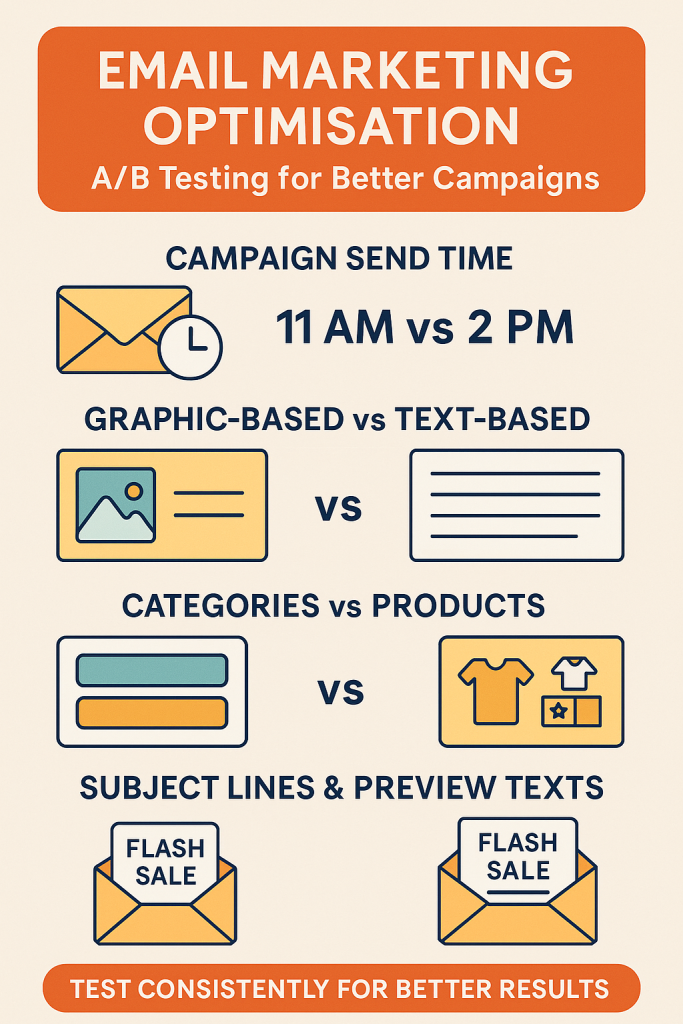
1. Campaign Send Time
The content is exactly the same—the only difference is when you send it.
- Why it matters: Different audiences engage at different times.
- Pro Tip: It’s fine to send the same email at different times to test.
Once you find your ideal sending time, try to keep your send times consistent—customers will get used to seeing your brand in their inbox at a specific time.
2. The Offers You’re Putting in Your Campaigns
A/B testing your offers is one of the most powerful levers in email marketing because the offer itself is often the single biggest driver of conversions. The right offer can double or even triple your click-through and purchase rates, while the wrong one can leave revenue on the table.
By systematically testing discounts, free shipping, bonus gifts, loyalty perks, or early access incentives, you gain hard data on what truly motivates your audience. This takes the guesswork out of campaign strategy and ensures you’re not just sending more emails, but sending the right offers that maximize engagement, conversions, and long-term revenue.
🎯 Top Offers to Test in Email Campaigns
- Percentage Discounts
- “Get 10% Off Your First Order” vs. “Take 20% Off Sitewide This Weekend.”
- Test the threshold — sometimes smaller, sustainable discounts convert as well as deeper ones.
- Dollar Amount Discounts
- “Save $15 on Orders Over $75” vs. “$25 Off Your Next Purchase.”
- Dollar savings can feel more tangible than percentages for certain products.
- Free Shipping Offers
- “Free Shipping on Orders Over $50” vs. “Free Shipping on Your First Order.”
- For many customers, shipping costs are the biggest barrier to purchase.
- Bonus Gift With Purchase
- “Get a Free Travel-Size Lotion When You Spend $50” vs. “Free Tote Bag With Any Order.”
- Works especially well in beauty, apparel, or lifestyle niches.
- Exclusive Early Access
- “Be the First to Shop Our New Collection” vs. “VIP Access to Limited-Edition Products.”
- Drives urgency and builds brand prestige.
- Buy More, Save More
- “Buy 2, Get 1 Free” vs. “Save 25% When You Buy 3 or More.”
- Encourages higher average order values.
- Loyalty or Points-Based Offers
- “Earn Double Points on Your Next Purchase” vs. “500 Bonus Points When You Shop Today.”
- Ideal for brands with loyalty programs.
- Limited-Time Flash Sales
- “Today Only: 15% Off Everything” vs. “48-Hour Flash Sale: Save 20%.”
- Test urgency windows to see which drives the fastest action.
- Contest or Giveaway Entry
- “Sign Up Today for a Chance to Win $100 Gift Card” vs. “Shop Now & Be Entered to Win.”
- Creates excitement and engagement beyond discounts.
- Content-Driven Offers
- “Download Our Free Style Guide” vs. “Get Exclusive Recipes With Your First Purchase.”
- Great for brands that want to balance value with profitability.
📌 The key is to test different types of offers, not just different sizes of discounts, to discover what resonates most with your audience — value, exclusivity, urgency, or rewards.
3. Graphic-Based vs Text-Based Emails
- Graphic-heavy emails: Bold visuals, lifestyle shots, and product images work great for big drops, launches, and sales.
- Text-based emails: Often feel more personal—especially if sent “from the founder.” These can cut through the noise and create an authentic feel.
- Test idea: Send most campaigns in a visual style but use text-based designs for special, high-importance campaigns to make them stand out.
Also, test lifestyle images vs product-only images. Some audiences click more when they can see the product in use; others prefer clear product shots.
4. Categories vs Products
When running email campaigns, one powerful test is whether your subscribers respond better to category-level promotions (broad themes like “Shop Men’s Shoes”) or specific product promotions (narrow focus like “Shop the AirFlex Running Shoe”).
How to Run the Test
- Create Two Versions of Your Email:
- Version A (Category-Focused): Highlight a product category or collection. Example: “New Summer Dresses — Shop the Collection.”
- Version B (Product-Focused): Highlight a single product with details. Example: “The Perfect Summer Dress — Now in Stock.”
- Keep Other Elements Consistent:
- Same subject line style, CTA design, send time, and audience segment.
- The only difference should be category vs. product focus.
- Measure Results Based On:
- CTR (Click-Through Rate): Do people engage more with broad options or specific items?
- Conversion Rate: Do clicks from product emails result in more purchases than category emails?
- Revenue per Recipient (RPR): Which approach actually drives more revenue?
Why Test This?
- Category Emails: Great for browsers and people in discovery mode. They provide options and appeal to wider interests.
- Product Emails: Great for buyers further down the funnel, especially if the product solves a specific pain point.
Example Scenario
- Category Test (A): “Shop Our New Coffee Collection → Espresso, Filter, Cold Brew.”
- Product Test (B): “Try Our New Espresso Blend → Rich Flavor, Limited Edition.”
The results will tell you whether your audience prefers browsing multiple options or being directed to one hero product. You can bias your main campaigns toward the winner but still mix in the other style to keep variety.
5. Subject Lines & Preview Texts
The gateway to your email’s success is your subject line and preview text. Test:
- Discount Mention vs No Discount Mention – “Save 20% Today” vs “Your New Favourite Arrived.”
- With Emojis vs Without Emojis – Some audiences love them, some don’t.
- All Caps vs Normal Case – “FLASH SALE” vs “Flash Sale.”
- With Ellipses vs No Ellipses – “Something Special Just For You…” vs “Something Special Just For You.”
Important: Don’t just judge based on open rates. A subject line that gets more opens but fewer conversions is a losing subject line. Always look at revenue impact.
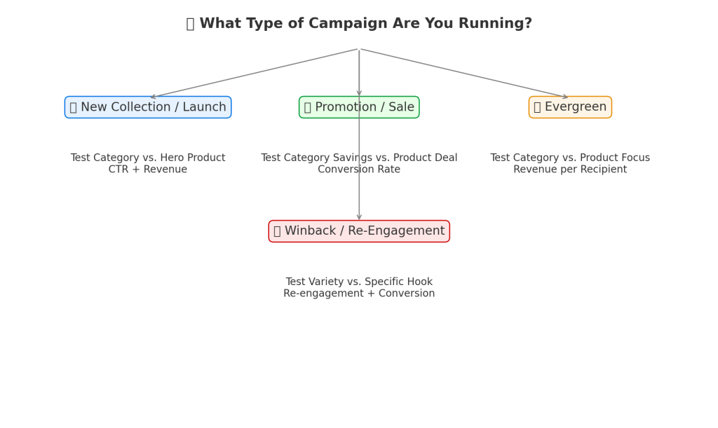
🗺️ A/B Testing Roadmap: Categories vs. Products
1. New Collection or Seasonal Launch
- Why Test? Subscribers are curious about what’s new but may not know what to buy yet.
- Recommended Test:
- Category Email (A): Showcase the full collection (e.g., “Explore Our New Summer Line”).
- Product Email (B): Spotlight one hero item (e.g., “The Summer Dress Everyone Will Want”).
- What to Watch: CTR & revenue. This test shows whether your audience prefers to browse or be guided to a specific “star” product.
2. Promotion or Sale
- Why Test? Some customers respond to broad savings, while others need a specific product to anchor the value.
- Recommended Test:
- Category Email (A): “Save 20% Across All Footwear.”
- Product Email (B): “20% Off Our Best-Selling Sneakers.”
- What to Watch: Conversion rate. This test reveals whether urgency around one product or broad savings drives more purchases.
3. Evergreen Campaigns (non-seasonal, ongoing emails)
- Why Test? Helps determine the most sustainable long-term strategy.
- Recommended Test:
- Category Email (A): “Discover Our Coffee Collection.”
- Product Email (B): “Try Our Signature Espresso Blend.”
- What to Watch: Revenue per recipient (RPR). This test highlights whether your audience is more responsive to general browsing prompts or specific product pushes.
4. Winback / Re-Engagement Campaigns
- Why Test? Inactive subscribers may re-engage with either variety or a strong product hook.
- Recommended Test:
- Category Email (A): “See What’s New in Store.”
- Product Email (B): “Our #1 Product Is Back in Stock.”
- What to Watch: Re-engagement (opens/clicks) + conversion. This test shows which message has more pulling power to reignite interest.
📌 General Rule:
- Test categories when you want to drive browsing and exploration.
- Test products when you want to create urgency and direct action.
6. Call-To-Action (CTA)
Testing the CTA allows you to determine which wording most effectively motivates your audience to take the desired action. Test:
Button Text
- Test action verbs (“Shop Now” vs. “Get My Discount” vs. “Discover More” vs “Add To Cart“).
- Compare benefit-driven CTAs (“Unlock Free Shipping”) vs. generic ones (“Click Here”).
- Button Color & Style
- Bright, contrasting colors vs. subtle, brand-colored buttons.
- Rounded vs. sharp corners; solid vs. outlined buttons.
- Placement in the Email
- CTA at the top vs. the middle vs. the bottom of the email.
- Single CTA repeated in multiple places vs. one at the end.
- Number of CTAs
- One clear CTA vs. multiple CTAs (e.g., “Shop Men’s” and “Shop Women’s”).
- Testing whether one focused option outperforms choice.
- CTA Length
- Short and punchy (“Shop Now”) vs. longer, benefit-driven (“Get 20% Off Today”).
- Personalization
- Generic (“Shop Now”) vs. personalized (“Shop Your Favorites”, “See Picks for You”).
- Tone & Style
- Formal (“Learn More”) vs. playful (“Let’s Do This 🎉”).
- Testing urgency (“Grab Yours Before Midnight”) vs. curiosity (“See What’s Waiting for You”).
- CTA Format
- Button vs. hyperlinked text vs. image-based CTA.
- Testing whether subscribers respond better to bold visuals or subtle text links.
🚀 Top 5 CTA Tests to Run First
Personal CTAs show subscribers you’re speaking directly to them.
Action Text
Test verbs that drive urgency and benefit (“Save Now vs. “Shop Now”).
Action-oriented CTAs almost always outperform generic ones.
Benefit vs. Generic
“Unlock Free Shipping” vs. “Click Here.”
Benefit-driven CTAs typically deliver higher CTR because they answer “what’s in it for me?”
Button Placement
CTA at the top vs. at the bottom vs. repeated in both spots.
Testing position often reveals surprising wins for mobile-heavy audiences.
Color & Contrast
High-contrast CTA buttons vs. subtle brand-colored ones.
Clear, bold buttons tend to catch more clicks.
Personalization
Generic (“Shop Now”) vs. personalized (“Shop Your Favorites”, “See Picks Just for You”).
7. Images
Images are one of the most influential elements in an email, and A/B testing them can uncover what really captures attention and drives clicks.
1. Product vs. Lifestyle Images
- Test: A clean product shot on a white background vs. the product being used in real life.
- Why: Lifestyle imagery often drives emotional connection, while product shots highlight details.
2. Single Image vs. Collage/Grid
- Test: One large hero image vs. a collage of multiple products.
- Why: Some audiences prefer focus, others like variety.
3. Static vs. Animated (GIFs)
- Test: Static image vs. motion graphics or GIFs showcasing multiple products.
- Why: Motion often captures attention, but can also distract or slow loading times.
4. People vs. No People
- Test: Product image with a person using it vs. product-only.
- Why: Faces and human interaction often boost relatability and CTR.
5. Background & Color Schemes
- Test: Neutral, minimal backgrounds vs. bold, colorful ones.
- Why: Color psychology can affect mood, urgency, and purchase intent.
6. Image Size & Placement
- Test: Hero image at the top vs. smaller supporting images further down.
- Why: Placement influences scanning patterns, especially on mobile.
7. User-Generated Content (UGC) vs. Branded Imagery
- Test: A customer photo vs. a polished studio shot.
- Why: UGC often feels authentic and trustworthy, while branded visuals feel aspirational.
8. Seasonal/Contextual Imagery
- Test: Generic product shot vs. themed/seasonal context (e.g., holiday setting).
- Why: Seasonal context can boost relevance and urgency.
9. With Text Overlay vs. No Text Overlay
- Test: Adding copy like “20% Off Today” on the image vs. keeping it clean.
- Why: Text overlays reinforce CTAs, but sometimes reduce clarity if overdone.
📌 Best Practices When A/B Testing Images
- Test one variable at a time (don’t change product, background, and text overlay in one test).
- Optimize for mobile loading speed (compressed, fast-loading images win).
- Track not just CTR, but also conversion rate to see if images lead to purchases.
- Use heatmaps (Hotjar, Crazy Egg) to study where attention goes in your emails.
🚀 Top 5 High-Impact Image Tests
- Product vs. Lifestyle Imagery
- Product shot on white background vs. product being used in real life.
- Often the single biggest test — lifestyle shots tend to boost emotional connection, but clean product images highlight details.
- Static vs. Animated (GIFs)
- Single static image vs. animated GIF showing multiple products or features.
- GIFs can drive attention and higher CTR, but sometimes static images load faster and convert better.
- User-Generated Content (UGC) vs. Branded Photography
- Polished studio photo vs. authentic customer photo.
- UGC often feels more relatable and trustworthy, especially in lifestyle niches like fashion, beauty, or fitness.
- Single Hero Image vs. Product Grid
- One large hero image highlighting one product vs. a grid showing multiple options.
- Hero images focus attention, while grids appeal to variety-seekers.
- With Text Overlay vs. Clean Image
- Image with promotional text overlay (“20% Off Today”) vs. plain image without text.
- Overlays reinforce the offer visually, but sometimes a clean image feels more premium.
📌 Pro Tip: Start with these five tests before diving into background colors, seasonal themes, or placement. They consistently reveal what your audience prefers and can quickly improve CTR and conversions.
📖 Mini Case Study: Lifestyle vs. Product Image Test
A mid-sized DTC skincare brand wanted to understand whether their audience responded better to clean product shots or lifestyle imagery in their email campaigns.
- Version A (Product Image): A polished studio shot of their new serum bottle on a white background.
- Version B (Lifestyle Image): A model applying the serum in a natural bathroom setting.
Results after sending to a 50/50 split of 20,000 subscribers:
- Version A CTR: 2.8%
- Version B CTR: 4.6% (a 64% increase)
- Revenue per recipient (RPR): $1.92 vs. $3.45
Takeaway: Lifestyle imagery outperformed clean product shots because it helped subscribers visualize themselves using the product, making the experience more relatable and emotionally engaging.
The Endless Testing Mindset
The best-performing brands aren’t lucky—they’re obsessed with testing. They’re constantly asking:
- What happens if we change this?
- Does this design work better?
- Are we sending at the right time?
Over time, small incremental improvements compound into massive results.
Key Takeaways
- Always test one thing at a time.
- Start with high-impact variables like send time, email style, and subject lines.
- Ensure you have a large enough sample for statistical significance.
- Judge success based on the right metric (clicks, conversions, revenue).
- Keep testing—because what works today might not work tomorrow.