
In ecommerce, your email list is pure gold. It powers high-ROI campaigns, fuels automated flows, and builds direct relationships with your customers.
That’s why getting the most out of your pop-up forms is so critical — they’re your #1 tool for turning anonymous visitors into subscribers. But simply launching a pop-up isn’t enough. To truly maximize performance, you need to continuously A/B test your pop-ups.
🚀 What is A/B testing?
A/B testing (also called split testing) means comparing two (or more) variations of your pop-up to see which performs better.
For example:
- Version A: 10% off offer, shows on loading
- Version B: 10% off offer, shows after 4 seconds
You then send a portion of your traffic to each version, and measure which one drives more sign-ups (or ultimately more revenue).
💡 Why is A/B testing your pop-up so important?
✅ Improves conversion rates:
Tiny tweaks — a new headline, a different photo, 3-second timing shift — can sometimes double your opt-in rate.
✅ Eliminates guesswork:
Rather than relying on gut feelings or copying competitors, you learn exactly what resonates with your audience.
✅ Maximizes your traffic ROI:
You’ve already paid for or earned that site traffic. Optimizing your pop-ups means more leads from the same number of visitors, reducing your customer acquisition costs.
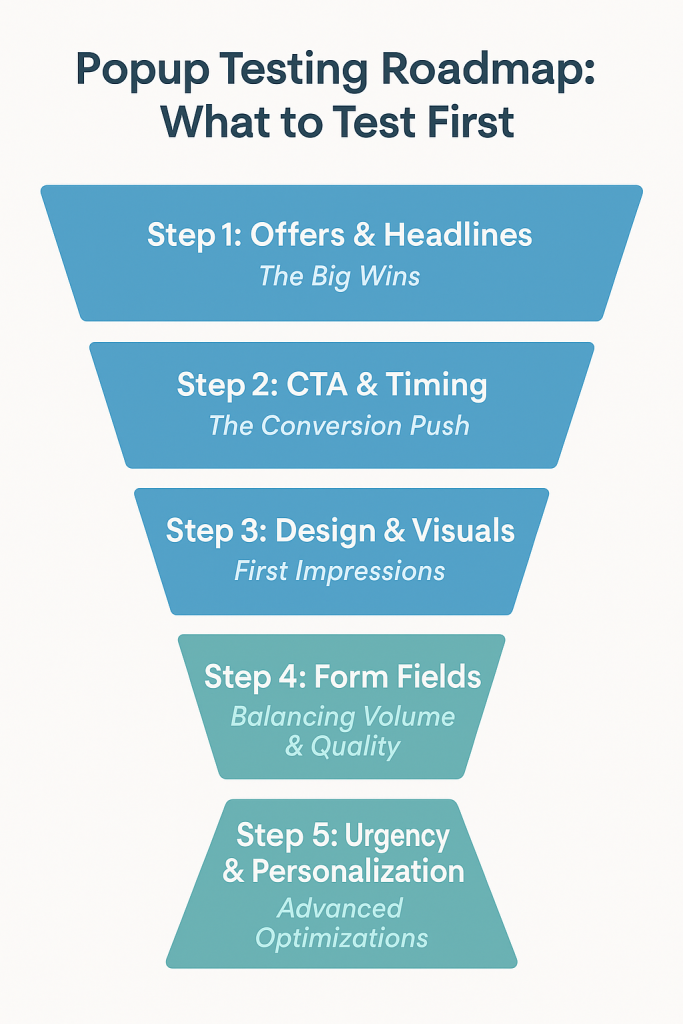
🏆 Top A/B tests to run on your pop-up forms
Here are the highest-impact areas to test.
🎁 1. The offer itself
The offer is the heart of your popup form, and testing it should be your first priority. Every customer demographic reacts differently to different types of offers. Some audiences respond best to monetary discounts, while others prefer perks like free shipping, a free gift, or access to exclusive content. By running split tests on different offers, you’ll quickly discover which incentive resonates most with your visitors and maximizes conversions — without unnecessarily cutting into your profit margins.
✅ Test:
- Discount vs. perk: 10% off vs. free shipping
- Dollar vs. percent: $10 off vs. 10% off.
- Cash back.
- Free shipping.
- Free gift with purchase.
- Mystery offers: “Spin to reveal your discount” vs. clear offer.
Even small differences in how you phrase or structure the deal can change conversion rates dramatically.
📝 2. Urgency cues
Scarcity and urgency are proven psychological triggers that can boost conversions, but their effectiveness varies by audience. Testing urgency cues will show you whether this motivates your audience or feels too pushy.
✅ Test:
Popups with countdown timers
“Limited-time offer”
No urgency cues at all.
⏱️ 3. Time delay & trigger
When your popup appears is just as important as what it says. Split test triggers such as instant load, timed delay (e.g., 5–10 seconds), exit-intent, and scroll depth. Some visitors will convert best when the popup appears as the site loads, while others need time to explore before being prompted. Testing helps you find the sweet spot for your audience.
✅ Test:
- 0, 4, 6, 8, 10 or 12 seconds after landing.
- Triggers like 30% scroll depth vs. exit-intent (triggering as they move to close the tab).
A/B testing these can help you find the sweet spot for your specific audience.
🎯 4. Call to Action
The CTA button is where the magic happens — it’s the final push that turns a visitor into a subscriber. The more action-oriented and benefit-driven your CTA, the better your chances of converting. See which phrasing drives the highest click-throughs.
✅ Test different button texts such as:
- “Join Now”
- “Add to Cart”
- “Get My Discount”
- “Unlock Access”
🖼️ 5. Photo content or graphic style
Images can dramatically influence performance. Test product-focused images, lifestyle photos, or even popups without images to see which drives more engagement. For some brands, showing the product creates excitement; for others, a distraction-free design works better. Let the data guide you.
✅ Test:
- Lifestyle vs. product-focused photos.
- Photo with a happy person vs. just the item.
- No image
- Static vs. subtle animations.
Visual changes can produce surprising lifts in engagement. You should also test the placement of the photos either next to the form or as a backdrop to the form.
✍️ 6. Copy & headline
Your headline is the first thing people notice, and often the deciding factor in whether they engage or ignore the popup. Test variations that highlight a clear benefit, create curiosity, or inject urgency. Even subtle shifts in tone can make a huge difference in how compelling your popup feels. Try:
- “Get 10% Off” vs. “Claim Your Exclusive 10% Discount”
- “Don’t Miss Out”
- “Join Our Email List” vs. “Get VIP Early Access & Perks”
- “Unlock Something Special”
- Fun & playful vs. elegant & minimal.
Also try microcopy tweaks in your CTA buttons like:
- “Reveal My Code” vs. “Get My Discount Now”
🎨 7. Colors & Design Elements
Visual design shapes first impressions. A bold, colorful popup may grab attention, but a minimalist, clean design may feel less intrusive and convert better. Test variations with different layouts, color schemes, and levels of visual emphasis to find which look aligns best with your brand while still driving signups.
✅ Test:
- Contrasting button colors vs. brand-neutral tones.
- Dark vs. light pop-up backgrounds.
Subtle shifts here can sometimes lead to significant gains.
📋 8. Form Fields
Every additional field you ask for increases friction. Test forms that ask for email only versus email plus name, name, email and preferences, or email plus SMS. While shorter forms usually convert better, adding a second field might increase lead quality. Split testing helps you strike the right balance between volume and value.
👉 9. Personalization
Generic messaging is easy, but personalization is powerful. Test popups tailored to traffic sources — for example, a visitor from a Facebook ad for a new collection could see “Sign up now for exclusive access to our latest drop,” while an organic blog visitor might see “Join 10,000+ readers getting our weekly style tips.” Personalization creates relevance, which translates into higher conversions.
✅ 10. Design and Layout
Visual design shapes first impressions. A bold, colorful popup may grab attention, but a minimalist, clean design may feel less intrusive and convert better. Test variations with different layouts, color schemes, and levels of visual emphasis to find which look aligns best with your brand while still driving signups.
🔬 How to A/B test effectively
- Change only one element at a time.
If you change headline and timing and photo, you won’t know what drove the improvement. - Run tests long enough to get statistically meaningful results.
Aim for at least a few hundred views per variant before deciding. - Track beyond sign-ups.
Some offers may boost opt-ins but attract low-quality leads who never buy. Integrate with your ESP or store data to see long-term revenue impact.
🚀 The bottom line
Pop-ups are your most powerful email capture tool. But the difference between a generic, one-size-fits-all pop-up and a rigorously A/B tested pop-up is often thousands in additional revenue every month.
By systematically testing your offer, form type, timing, close options, imagery, copy, and colors, you can dial in the perfect combination that maximizes your list growth — and ultimately, your sales.