In 2025, your customer’s attention span is razor-thin and their expectations sky-high. With social media delivering instant dopamine hits, your emails now have to work twice as hard to capture attention, deliver value, and drive conversions.
That’s why design isn’t just decoration—it’s revenue. The visuals you send are often the only way customers experience your brand. A poorly designed email gets archived or deleted; a well-designed one becomes something they look forward to opening.
When you combine striking visuals with content that triggers those dopamine hits, you create a powerful feedback loop: customers begin to associate your emails with rewarding experiences, making them far more likely to engage in the future. This loop fuels higher open rates, stronger engagement, and ultimately, more sales.
The problem? Most emails fail because they’re not built for conversion. They’re cluttered, lack a clear hierarchy, and are hard to scan. Poor design frustrates readers and kills revenue. Conversion-focused design, on the other hand, ensures your emails don’t just look good—they perform.
Here are the core design principles every brand must follow to create emails that engage, delight, and drive sales—plus powerful enhancements to take them to the next level.
1. Make It Easy to Shop With Large, Prominent Buttons
Your emails should be designed for lazy thumbs. Customers don’t want to hunt for how to buy.
- Use large, high-contrast “Shop Now” buttons that stand out immediately. This has a massive impact on coversions.
- Place them strategically above the fold in every email, especially after highlighting a benefit or testimonial. This way, every customer has the ability to visit the site and go down the funnel.
- Make sure they’re mobile-friendly—large enough to tap without zooming in.
- Use high quality imagery that resonates with the brand’s aesthetic.
2. Keep It Visually Consistent With Your Website and Instagram
Brand consistency builds trust and recognition.
- Replicate your website’s look and feel in your emails to avoid disrupting the engagement flow. Use the same brand colors, fonts, icons, and product styling. Design must strictly follow brand guidelines for a cohesive brand experience.
- Align email design elements with the website style to maintain brand uniformity.
- Use a uniform alignment style throughout the email.
- Ensure your emails visually match your social media page. When customers click from an email to your site or socials, it should feel seamless—like one continuous brand universe.
- A consistent visual identity increases brand recall and makes customers more likely to buy.
3. Design With Your Audience in Mind
Your design should reflect who you’re speaking to.
- If your audience is older, use larger fonts and clearer spacing for easier reading.
- Younger, trend-savvy shoppers might respond to playful graphics, emojis, or bold, dynamic layouts.
- Know your demographic and test what resonates.
4. Focus on A Single Call-To-Action (CTA)
Overloading emails with multiple instructions creates decision fatigue.
- Stick to one clear and direct CTA per email. For example: “Shop Now,” “Discover the Collection,” or “Read the Full Story.”
- Ensure a primary CTA is visible without scrolling.
- Include a clickable CTA in every section to maximize engagement opportunities.
- Create a sense of urgency to encourage immediate action e.g. “Shop 10% Off Now!”
- Avoid distracting backgrounds and use contrasting colours to get your CTAs to stand out.
- Always finish the email with a SHOP ALL button.
5. Avoid Bland, Generic Copy
Your emails shouldn’t sound like every other brand.
- Inject your unique brand voice, personality, and even a little humor or wit.
- Use punchy, benefit-driven headlines that create curiosity or excitement.
- Avoid safe, boring lines like “Check out our products.” Reflect the tone of the subject line.
6. Make Every Product Easy to Buy
When showcasing products:
- Include individual “Shop Now” buttons for each product.
- Underline product names or descriptions so customers immediately recognize them as clickable links.
- This intuitive design eliminates friction and boosts click-through rates.
7. Never Put Navigation Buttons in the Header
Adding navigation buttons in the header is distracting and can lead to overwhelm and decision fatigue. They should only be in the footer when the person can potentially be ready to browse after they have browsed the collection in the email.
- Place “Shop By Category” buttons at the bottom of your emails (e.g., “New Arrivals,” “Best Sellers,” “Under $50”).
- This encourages additional browsing even if your main CTA didn’t immediately convert.
8. Don’t Bore Subscribers With Repetition
Subscribers crave novelty.
- Avoid sending the exact same style of email every time.
- Mix up your content while staying on-brand:
- One day it could be a playful quiz, another a powerful testimonial, and another a behind-the-scenes look.
- Keep your designs fresh and dopamine-triggering while maintaining core brand elements like color palette and tone.
9. Make Social Proof Unmissable
Social proof is your best salesperson.
- Feature customer testimonials prominently, with big images and compelling “Shop Now” buttons right underneath.
- Use authentic photos or user-generated content when possible.
- Highlight quotes that overcome common objections (“I thought it was pricey until I tried it!”).
10. Deliver Unique, Visual Value
Always ask: “What does this email give my customer that they can’t easily get elsewhere?”
- Offer value in a visual form:
- Infographics explaining benefits
- Diagrams showing product features
- Comparison charts that pit you against competitors
- Visuals make your emails easier to skim, more memorable, and more shareable.
11. Centre Your Buttons to Maximize Clicks
When buttons are placed on the far left, mobile users—most of whom hold their phones in their right hand—have to awkwardly stretch their thumb to reach them. This small inconvenience adds unnecessary friction, which can significantly reduce conversions. Centered buttons, on the other hand, are easy to tap regardless of which hand is holding the device, creating a smoother, more intuitive experience that encourages more clicks.
12. Optimize for the Skim Not the Read
You’ve got 2–4 seconds to hook your audience. Make every pixel count:
- Keep it simple: No fluff. No clutter. Deliver one clear message fast.
- Structure matters: Break content into distinct sections—intro, offer, CTA—so it’s easy to follow.
- Cut the copy: Three-second viewers won’t read paragraphs. Make every word work.
- Headline power: Bold, clear headlines and subheads should carry the main message on their own.
- Stay on brand: Fonts, colors, and graphics should scream you, so your audience instantly recognizes your emails. Skimmable emails get opened, read, and clicked—because they respect the reader’s time.
13. Pay attention to aesthetics.
Make content easy to scan. Someone quickly scrolling through the email should be able to clearly and quickly understand each main messaging point in the email.
- Use ample white space that makes the content easy to scan.
- Use emojis if it aligns with your brand’s tone and style.
- Use images that clearly relate to products or content being featured.
- Use icons that represent content to highlight unique selling points instead of bullet points.
- Identify opportunities to turn images into GIFs to improve engagement.
- Ensure visuals are extremely high resolution.
🔥 Bonus Power Principles to Supercharge Your Emails
✅ Stand out
Templated designs and generic layouts make you blend in with every other brand. With new competitors launching daily, the only way to stand out is through unique, memorable content. If you fail to differentiate, you’ll disappear into the noise—forgotten by customers and passed over for brands that stand out.
✅ Optimize for the Skim, Not the Read
- Break up text with line breaks.
- Use bolded headlines, short blurbs, and icons.
- Most people skim, so design for easy scanning.
✅ Provide Instant Dopamine
- Incorporate playful elements like puns, emojis, or a clever twist in your CTA.
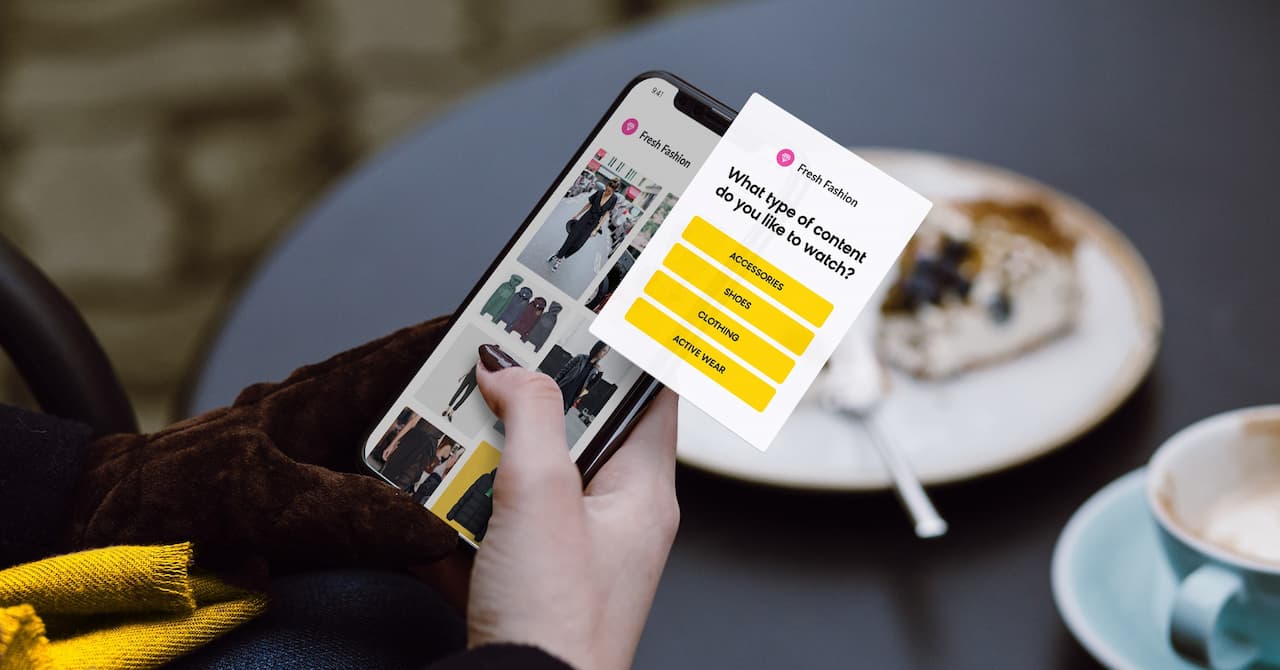
- Surprise subscribers with puzzles, quick quizzes, or a GIF to hold their attention.
✅ Keep It Short and Sweet
- Ideally, your email should be no longer than one to two scrolls on mobile.
- One main takeaway per email means it’s more likely to stick.
✅ Build Emotional Connection
- Tell a micro story: why you started, a behind-the-scenes moment, or a customer journey.
- Emotion is a shortcut to memorability.
In Conclusion: Design to Delight—and Convert
The best emails in 2025 are more than just pretty—they’re engineered for tiny attention spans, dopamine-driven habits, and mobile-first shopping. They respect your customer’s time while delivering maximum clarity, joy, and urgency.
By following these principles—big clickable CTAs, brand consistency, audience-centric design, variety, social proof, and unique visual value—you’ll create emails that not only get opened but drive real, repeat revenue.


