
In the world of ecommerce, your email list is one of your most valuable assets. That’s why a well-crafted popup form — designed to convert visitors into subscribers — can directly impact your revenue and long-term growth. If your pop-up form converts poorly, your entire email strategy will suffer—because weak signups lead to weak flows and campaigns over time.
This guide breaks down:
✅ What popup forms are
✅ Why they’re the most effective email capture type
✅ The must-have components of a high-converting popup
✅ Common mistakes (and how to fix them) so you maximize sign-ups and profitability
✨ What is a Popup Form?
A popup form is a small window or overlay that appears on a visitor’s screen while they browse your site, usually asking them to sign up for your email list.
Unlike static signup forms (like a sidebar or footer opt-in), popups instantly capture attention. When paired with an enticing offer (like a discount or free shipping), they become a powerful tool for growing your subscriber list.
🚀 Why Popup Forms Are So Valuable
They’re the highest converting list builder.
Studies show that popups can drive conversion rates between 3% and 11%, depending on the offer, timing, and targeting — far higher than typical embedded forms.
That means if you have 10,000 monthly visitors, a good popup could net you 300–1,100 new subscribers every month. Over time, these new subscribers fuel repeat sales, holiday campaigns, and more.
They increase long-term profitability.
Email is your owned channel. Once you’ve captured a lead, you can market to potential customers over and over — without paying per click like you would with ads. A great popup lowers your customer acquisition costs (CAC) and boosts customer lifetime value (CLV), improving your bottom line.
🛠️ Components of a Powerful & Effective Pop-up Form
It’s important to recognize that popup form performance isn’t driven by design alone — audience demographics play a huge role. Research consistently shows that responsiveness to email marketing varies across age and gender groups: older consumers and women are generally more likely to engage, while younger audiences and men tend to be less responsive overall. This is why you may find that a simple, average-looking popup can sometimes outperform expectations with a 10% conversion rate, while a sleek, well-designed form may only manage 4%.
When designing your popup form, it’s essential to keep the customer journey front and center. Think about what a visitor already knows about your brand at the moment they see the form. Most people arriving on your site are coming either from an ad or from organic content you’ve shared elsewhere. They’ll click through and encounter your popup. This is the very first checkpoint in their journey with you — and it needs to feel consistent with what they already know about you.
Your offer and messaging should directly connect to what they’ve just seen in the ad or content that brought them here. If the popup aligns with their expectations and reinforces the value they already associate with your brand, it feels natural and trustworthy. If it feels disconnected, confusing, or irrelevant, you risk losing them before they ever join your list.
For example: if someone clicks on a Meta ad for your new sustainable denim collection, the popup they see should highlight that exact benefit — “Sign up now for early access to our eco-friendly denim line.” This consistency reassures them they’re in the right place and makes the transition from ad → site → signup seamless.
✅ Ad → Landing Page → Popup Alignment Checklist
- Ad Messaging
- Does your popup reflect the same promise, benefit, or product shown in the ad?
- Example: Ad highlights eco-friendly denim → Popup offers early access to the denim line.
- Visual Consistency
- Are the images, colors, and design elements consistent across ad, site, and popup?
- Consistent visuals build trust and reassure visitors they’re in the right place.
- Offer Continuity
- Is the offer in your popup relevant to the intent behind the ad/content click?
- Example: Ad promotes a sale → Popup offers extra savings or VIP access to the sale.
- Customer Expectations
- Does the popup feel like a natural next step in the journey?
- If it feels jarring or irrelevant, rethink the messaging.
- Seamless Flow
- Ad → Landing page → Popup should feel like a single, connected conversation.
- Ask yourself: If I clicked this ad, would this popup feel like the right next step?
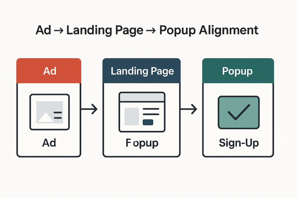
The key takeaway is that list growth isn’t purely about design aesthetics — it’s about aligning the right offer and message with the right audience. That’s why testing is essential. When you tailor your forms and incentives to match the expectations of different demographics, you turn what seems like “randomness” into a repeatable, scalable strategy.
Elements of a High-Converting Pop-up Form
✅ A Strong Offer
Your offer is the leading indicator of popup performance—it’s what ultimately determines whether someone signs up or clicks away. No other factor influences performance as strongly as the incentive you put forward. That doesn’t mean you need to slash your margins with deep discounts like 25% off.
The goal is to strike the right balance between profitability and conversions. In other words, you want to maximize the number of signups while giving away as little as possible on the front end.
The best-performing offers are those that feel valuable to the customer but remain sustainable for your business. Beyond discounts, here are some powerful alternatives you can test:
- Exclusive content (e.g., style guides, recipes, “insider” tips)
- Early access to new product launches or limited-edition drops
- Free shipping or a shipping upgrade
- Free gift with purchase (low-cost, high-perceived-value item)
- Entry into a giveaway or loyalty points for signing up
- First to know alerts for flash sales or VIP-only offers
Follow the matrix below to understand how to find the right offer for your brand:
- High AOV & Lower % Margin? Go for a fixed “$ Off” offer
- Lower AOV & Higher Margin? Go for a “% Off” offer
- Mid-High AOV w/Small & Popular SKUs? Try a “Free Gift with Purchase” offer
By experimenting with these, you can find the sweet spot where your popup delivers high conversions without eroding your margins. Test different offers, as it is the ultimate lead indicator of list growth success.
✅ A Clear and Prominent Value Proposition
Your value proposition should take center stage — bold, clear, and almost jumping off the page — with every other element kept secondary. When visitors arrive from social media, they’re often distracted and not in a highly focused state of mind.
That’s why you need to grab their attention instantly and make it crystal clear: what’s in it for them if they join your email list? The quicker they understand the benefit, the more likely they are to convert.
Value Proposition Best Practices for Popups
- Lead with the benefit — spell out what subscribers gain (discount, exclusive access, useful content).
- Keep it short and clear — one powerful sentence or phrase works better than long explanations.
- Make it visually dominant — larger font, bold text, or contrasting color so it “jumps off the page.”
- Use action-oriented language — “Get,” “Unlock,” “Enjoy,” instead of passive wording.
- Address their state of mind — assume they’re distracted; clarity beats cleverness.
- Support with visuals — icons, product images, or social proof to reinforce the promise.
High-Converting Value Proposition Examples
- Unlock 10% Off Your First Order Today
- Be the First to Shop Our New Collection
- Get Free Shipping on Your Next Purchase
- Join 25,000+ Happy Customers Who Save Weekly
- Exclusive VIP Access — Sales Before Anyone Else
- Your Guide to Effortless Style — Free When You Sign Up
- Win a $100 Gift Card — Join the List to Enter
- Never Miss a Drop — Early Access Straight to Your Inbox
- Discover Insider Tips & Tricks You Won’t Find on Social Media
- Enjoy Members-Only Perks (Without the Membership Fee)
✅ A Micro-Commitment + Zero Party data Collection
One of the most powerful psychological levers in marketing is the micro-commitment principle. Lead with a discount micro-commitment: “Want 10% off today?” People are far more likely to follow through on a larger action once they’ve already taken a smaller, low-friction step (saying yes). Pairing a micro-commitment with zero-party data collection turns your pop-up from an interruption into a helpful, high-converting moment.
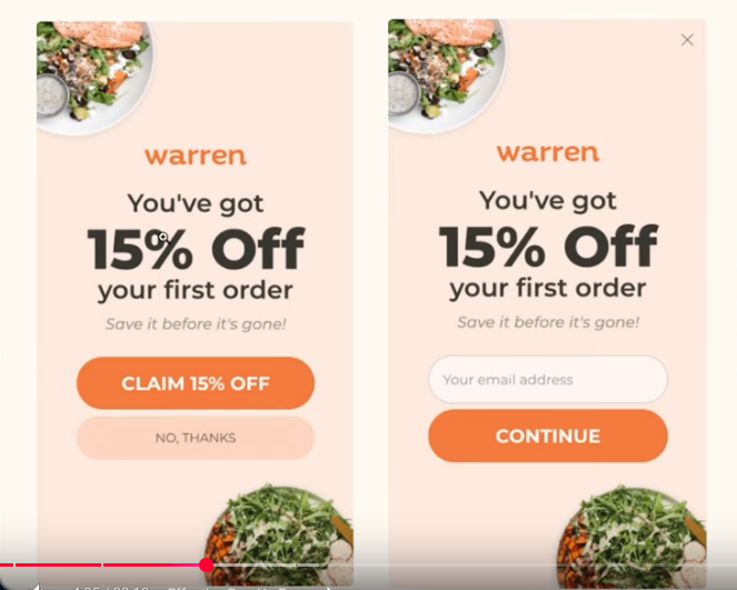
In practice, this means starting with the smallest possible ask — such as a simple Yes/No question — before leading into bigger commitments like entering an email, opting into SMS, or redeeming a discount code. Each small “yes” conditions the visitor to say “yes” again, making it feel natural to continue.
🎯 Micro-Commitment Ideas to Capture Phone Numbers
- Exclusive Upgrade Offer
“Want an extra 5% off? Enter your number and we’ll text it to you instantly.” - Early Access Hook
“Be the first to shop new drops. Add your number for early access before anyone else.” - Shipping/Order Perks
“Want real-time shipping updates? Add your number to track your order by text.” - VIP List Framing
“Join our VIP text list for members-only offers and insider perks.” - Limited-Time Incentive
“Get a bonus gift with your first order — we’ll text you the code.”
This layered approach not only increases signups but also creates a more engaged, higher-quality list, since subscribers are progressively choosing deeper levels of connection with your brand.
❌ Common Mistakes with Popup Forms (And How to Fix Them)
🚩 Weak Offer
Your popup form is often the first direct interaction a visitor has with your brand. If the offer feels weak, generic, or uninspiring—like “Join our newsletter”—it sends the message that you don’t value your subscriber’s attention. A popup form without a compelling offer doesn’t just fail to grow your list—it can actually train visitors to ignore your messaging altogether.
A strong offer gives visitors a clear reason to subscribe now, not later. Here are the key components:
- Immediate Value
- Discount (e.g., 10% off your first order).
- Free shipping.
- Free gift with purchase.
- Access to exclusive content or VIP perks.
- Relevance
- Offer tailored to what the visitor cares about (e.g., style guide for a fashion brand, free recipe ebook for a food brand).
- Clarity
- Simple, direct wording—no jargon or confusion.
- Example: “Unlock 10% off instantly” instead of “Sign up for our updates.”
- Urgency (Optional)
- Add time-sensitive elements: “Today only” or “First 500 subscribers.”
- Low Friction
- Keep the form short (name + email is often enough).
- Reduce effort required to claim the offer.
Weak vs. Strong Popup Offers
| Weak Offer | Why It Fails | Strong Offer | Why It Works |
|---|---|---|---|
| “Join our newsletter” | No clear value, generic, uninspiring. | “Get 10% off your first order today” | Immediate, tangible value and urgency. |
| “Sign up for updates” | Vague—what kind of updates? Why should they care? | “Be the first to access new drops + VIP perks” | Relevant incentive that reduces buying friction. |
| “Subscribe for news” | Doesn’t answer what’s in it for me? | “Get our exclusive style guide + 15% off” | Offers both content value and a discount. |
| “Enter your email here” | Transactional, no motivation provided. | “Unlock free shipping on your first purchase” | Builds exclusivity and makes subscriber feel special. |
🚩 Too Many Requests
The best popup forms strike a balance between enticing subscribers to sign up and capturing the right data to fuel personalization. At a minimum, always ask for a name and email address—these two fields let you personalize communication without adding friction.
To go a step further, consider collecting zero party data by including preference fields that are directly relevant to your brand. This will help you send more targeted content to your audience. For example, a fashion brand could ask about preferred styles (casual, minimalist, formal), while a food brand might ask about dietary preferences (vegan, gluten-free, keto). These small, low-friction requests make subscribers feel understood and allow you to tailor content, offers, and recommendations that resonate.
Avoid asking for high-barrier data like physical address in the initial popup, as this can feel intrusive and reduce conversions. The goal is to gather just enough information to deliver value while keeping the sign-up process effortless.
Good vs. Bad Popup Fields
| Good Fields to Ask | Why They Work |
|---|---|
| First Name | Enables simple personalization (e.g., “Hi Sarah”) without adding friction. |
| Email Address | Essential for campaigns, flows, and ongoing communication. |
| Preferences (brand-relevant) | Helps tailor content (e.g., style, size, diet, interests). |
| SMS (optional, secondary step) | Useful for brands ready to build SMS lists, but should be framed as a bonus channel. |
🚩 Poor Timing
The timing of your popup form can make or break conversions. Some brands see better results when the form appears instantly on page load, while others get higher conversions waiting 4–8 seconds. Since no single rule applies to all audiences, A/B testing different timings is essential to find the sweet spot for your brand.
Popup Timing Testing Framework
| Timing Variation | When It Appears | Metrics to Track | Why Test It |
|---|---|---|---|
| Immediate (0s) | As soon as page loads | Conversion rate, bounce rate | Captures attention before distraction |
| Short Delay (4s) | 4 seconds after load | Conversion rate, engagement time | Allows visitor to orient before prompt |
| Medium Delay (8s) | 8 seconds after load | Conversion rate, bounce rate, exit rate | Engages only those showing interest |
| Long Delay (15s+) | 15 seconds or more | Conversion rate, time on site, exits | Targets highly engaged visitors |
| Scroll-Triggered | After 25–50% page scroll | Conversion rate, time on site | Reaches users once they show deeper intent |
| Exit-Intent | On attempt to leave page | Conversion rate, cart abandonment rate | Last-chance offer to save the conversion |
By waiting for signs of engagement, your popup feels like a natural part of the customer journey rather than an interruption — which dramatically increases the chances of conversion.
🚩 Slow Loading
A popup form should enhance your site’s user experience, not sabotage it. Unfortunately, heavy scripts or poorly optimized popup forms can do just that. Slow-loading popups create friction, frustrate visitors, and increase bounce rates—especially on mobile, where speed matters most. Instead of engaging your audience, a sluggish popup makes your brand feel clunky and unprofessional. Even worse, if the popup lags or fails to load properly, you lose a critical opportunity to capture a subscriber altogether.
How to Avoid This Problem
- Choose Lightweight Popup Tools – Use forms that are optimized for speed and don’t overload your site with bloated scripts.
- Test on Mobile and Desktop – Ensure the popup loads instantly across devices, since most visitors will discover you on mobile.
- Limit Third-Party Scripts – Every extra script can slow things down. Only keep the integrations you actually need.
- Lazy Load Wisely – Make sure the popup is set to load efficiently without blocking the rest of the page content.
- Regular Speed Checks – Test your site’s speed with and without popups (e.g., Google PageSpeed Insights, GTmetrix) to ensure performance isn’t suffering.
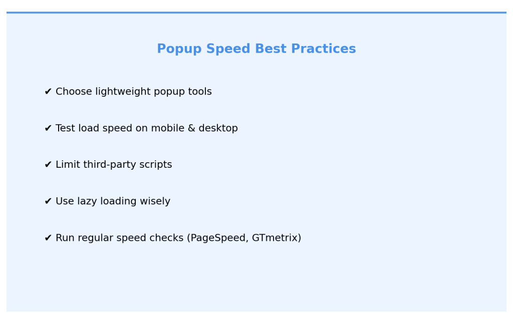
⚡ Pro Tip: A popup should feel seamless, appearing smoothly and without delay—if it feels heavy to you, it definitely feels heavy to your visitors.
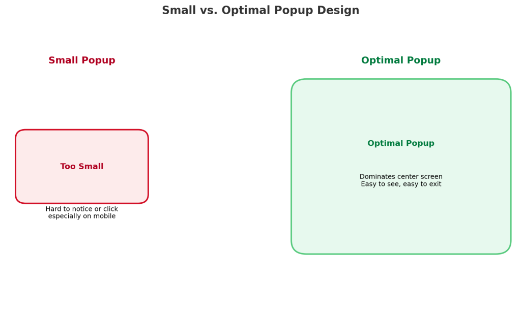
🚩 Too Small
Small popups may seem subtle, but they often backfire—especially on mobile. When a form is too small, visitors either miss it entirely or struggle to click into it, creating frustration instead of engagement. A better approach is to design a popup that dominates the center of the screen, making it impossible to ignore while still maintaining a clean, user-friendly look. Just as important, always ensure there’s a clearly visible close button so users feel in control. This balance—high visibility without being intrusive—is what maximizes conversions while keeping the user experience positive.
🚩 Too Much Copy
Popup forms need to grab attention and drive action in seconds. In 2025, attention spans are shorter than they’ve ever been. When you cram your form with paragraphs of text, visitors get overwhelmed and tune out. Long-winded copy makes the popup feel like work instead of an easy opportunity, which leads to lower signups and higher closes. The best-performing popups keep it short and sharp—under 10 words of copy. That means:
- One headline that instantly communicates value.
- One short sentence of subtext to clarify or add context.
- One clear button with a call-to-action (e.g., Get 10% Off).
Less clutter, more clarity—so the visitor’s focus is exactly where it should be: on taking action.
Weak vs. Strong Popup Copy Examples
| Weak Copy (Too Much Text) | Strong Copy (Under 10 Words) |
|---|---|
| “Sign up for our newsletter to get updates, news, and product information. We’ll also send you special offers and let you know when we launch new products.” | Headline: Get 10% Off Today Subtext: Join our list for instant savings. CTA: Claim Discount |
| “We’d love to keep you updated on our store and products. Subscribe to get notifications about new arrivals and exclusive deals before anyone else. Don’t miss out!” | Headline: Early Access Awaits Subtext: Be first to shop new drops. CTA: Join Now |
| “Please sign up to our email list to receive our latest news, promotional offers, updates, and announcements. We promise not to spam you.” | Headline: Free Shipping Today Only Subtext: Subscribe to unlock your perk. CTA: Unlock Offer |
🚩 Too Easy to Close
A powerful popup strategy is to replace the visible “X” close button with a text-based opt-out link like “No, I’m not interested in saving 20%.” Why does this work? Because when visitors see a popup, their instinct is to immediately click the “X” without even reading the offer. By making the opt-out option the only clear exit, you force them to pause, read the offer, and consciously decide to reject it.
This simple shift increases the likelihood that they’ll reconsider and opt in, because the act of reading “No, I’m not interested in saving 20%” makes the value of the offer explicit. It’s a subtle psychological nudge that keeps attention on your incentive and dramatically improves conversions without adding friction.
Here are 3 strong opt-out copy variations you can use instead of the generic “No, I’m not interested”:
- “No thanks, I’ll pay full price.”
→ Highlights the pain of missing out on a discount. - “No, I don’t want early access to new drops.”
→ Reinforces exclusivity and scarcity. - “No, I’ll skip my free shipping.”
→ Frames the opt-out as giving up a tangible benefit.
⚡ Pro Tip: The key is to make the opt-out phrasing reflect the value of the offer—so rejecting it feels like a loss.
🚩 Adding Navigation Links to the Form
Adding navigation links to a popup form distracts visitors from the main action you want them to take—completing the form. Here’s why it negatively affects conversion rates:
1. Distraction from the Primary Goal: A popup form usually has a single purpose—collecting leads, sign-ups, or conversions. By adding navigation links, you’re giving users an “escape route” that pulls them away from the form. Instead of entering their details, they may click off to explore other pages and never return.
2. Decision Fatigue: Every additional link creates more choices for the user. Instead of focusing on one simple decision—“Should I submit this form?”—they’re presented with competing options.” More choices reduce the likelihood of conversion because the user’s attention is fragmented.
3. Loss of Momentum: Popups usually appear when a user is already engaged with your content (e.g., scrolling, exiting, or after a certain time). At this moment, you want to capture that momentum. Sending them elsewhere breaks the flow, lowering the chance they’ll come back to complete the form.
4. Signal of Unclear Priorities: A popup should feel purposeful and direct. When you add navigation links, it dilutes the message and makes the form feel secondary. Instead of showing confidence in the offer, it suggests, “Maybe this form isn’t that important, go look around instead.”
5. Increased Bounce Risk: Once users click a link in the popup, they may not find what they expected, get distracted, or even leave your site entirely. That’s a lost opportunity you could have converted.
👉 Best Practice: A popup form should be laser-focused on one action—sign up, download, or subscribe. Keep it clean, free of distractions, and avoid navigation links. If you need to provide additional information, use microcopy (short explanatory text) within the popup rather than linking out.
🚩 Not Split Testing Your Form
Without testing different headlines, offers, designs, triggers, and timing, you’re essentially guessing at what will convert best — and leaving money on the table. What resonates with one audience segment may fall flat with another, and even small tweaks can double or triple your conversion rate. Split testing removes the guesswork, giving you hard data on what actually works so you can refine and scale. Skipping this step means settling for average results when your popup could be performing at its full potential.
🔑 High-Impact Popup Elements to Split Test
- Offer Type — Discount vs. free shipping vs. free gift vs. exclusive content.
- Headline — Benefit-driven vs. curiosity-driven vs. urgency-driven messaging.
- Call-to-Action (CTA) — Button text like “Join Now” vs. “Get My Discount” vs. “Unlock Access”.
- Timing — Instant load vs. 5-second delay vs. exit-intent vs. scroll depth.
- Design & Layout — Minimalist vs. bold design, image-based vs. text-heavy.
- Form Fields — Email only vs. email + name vs. email + SMS.
- Visual Elements — With product image vs. lifestyle image vs. no image.
- Personalization — Generic message vs. segmented by source (e.g., from Facebook ad vs. from Pinterest).
🚩Not Optimizing for Mobile
The majority of visitors encountering your popup and receiving your emails will be on a mobile device, so if the form isn’t mobile-friendly, you’re instantly losing conversions. A popup that’s too large, hard to close, or awkward to fill out creates friction and drives people away. To maximize signups, make sure your popup is fully responsive, easy to navigate, and designed with the mobile experience in mind.
✅ Mobile Popup Optimization Checklist
- Responsive design — Popup scales smoothly across all screen sizes.
- Readable text — Minimum 16px font size so users don’t need to zoom.
- Simple form fields — Ask only for essentials (e.g., email or phone, not 5+ fields).
- Fast load speed — Optimized images and code so the popup doesn’t lag or stall.
- Large tap targets — Buttons and fields sized for thumbs, not cursors.
- Non-intrusive placement — Popup doesn’t block the entire screen or break navigation.
- Test on real devices — Preview on both iOS and Android before going live.
🚩Asking for Email and SMS on the Same Form
A single “email + SMS” checkbox creates friction, depresses opt-in rates, and—depending on jurisdiction—may be unlawful. Split the asks, make SMS clearly optional with proper disclosures, and you’ll be safer and convert better.
- EU/UK (GDPR/PECR): Consent must be specific per channel—email and SMS require separate opt-ins.
- US (TCPA): Marketing texts need prior express written consent with required disclosures; consent can’t be a condition of purchase.
- Carrier/CTIA rules: If someone opts into your texts, that consent applies to your SMS program. It doesn’t automatically cover email—or a different text campaign.
🚩Using a Flyout Form
Flyout forms consistently underperform compared to popups when it comes to driving email sign-ups and conversions.
🏆 Bottom line
A high-converting popup isn’t just a “nice to have” — it’s one of the most profitable tools in your ecommerce marketing stack.
It builds your email list, fuels automated flows and campaigns, and dramatically increases your lifetime ROI on every website visitor.