
If you want your emails to not just look good but actually convert, you need to master their structure. A well-designed email guides the reader’s eyes naturally toward a click, keeping friction low and engagement high. Every high-performing marketing email is built around four main sections: Hero, Bridge, Product, and General CTA.
Let’s break them down.
1. The Hero Section — Your Above-the-Fold Powerhouse
The Hero is the most important section of your email because it sits above the fold. This means it’s the first (and often only) part your audience will see. In fact, most people will never scroll—so you need to give them everything they need to act without moving a finger.
75% of your design effort should go into the Hero.
A winning Hero section includes:
- Clear headline – Grab attention instantly.
- Strong graphic – Visuals should pop and support your message.
- Clear value proposition – Why should they care? Spell it out.
- Prominent “Shop Now” button – Always give an immediate way to click.
Pro tip: Place a CTA button right at the top. That way, every open has the potential to convert without scrolling.
The Reverse Triangle Hierarchy
Think of the Hero layout as a funnel for the eyes:
Headline → Body → CTA
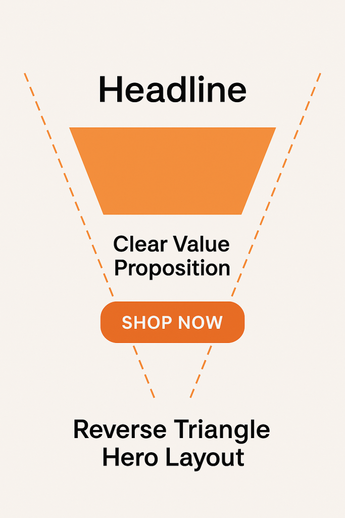
This creates a natural downward flow that guides the reader straight into the button click. Every section of your email should follow this “Reverse Triangle” design principle.
2. The Bridge Section — Smooth Transition & Support
The Bridge connects your Hero to the rest of the email. It supports your main message and often acts as a segue to the Product Section. Not every email will have a Bridge—but when used well, it reinforces the Hero and keeps the reader moving down.
Key elements of a Bridge section:
- Subheadlines – Make your supporting points skimmable in seconds.
- Supporting visuals – Graphics, photos, or small icons.
- Callouts – Highlights of benefits, features, or testimonials.
Types of Bridge content can include:
- Short supporting copy
- Product descriptions and features
- Testimonial highlights
- Photo gallery or image grid
- Step-by-step instructions or tips
Rule of thumb: Keep it clean, clear, and easy to skim. Limit yourself to one or two key points per bridge so you don’t lose attention.
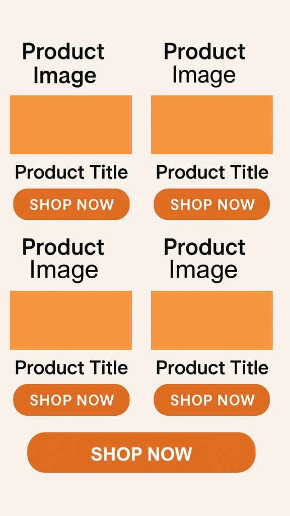
3. The Product Section — The Clickable Showcase
This is where you highlight specific products or categories. The goal is simple: make it effortless for someone to click and buy.
Best practices for the Product Section:
- Give each product its own CTA button or make the title a clickable link.
- Use high-quality product images.
- Include concise descriptions that focus on benefits.
- Keep layouts clean so the products shine.
Avoid this common mistake: Only including a single “Shop Now” button for all products. If you do this, the customer thinks they’ll need to search for the specific product themselves on your site—which adds friction and affects conversions.
(Insert example image: Product grid with each product having its own button + a general CTA below.)
4. The General CTA — Capture the “Maybes”
Even after seeing your products, some people may not click because nothing caught their eye. That’s where a General CTA saves the day.
Placed at the bottom of your email, a General CTA invites them to:
- Browse your store
- See your latest arrivals
- Explore categories
This ensures you don’t lose potential customers who are interested but undecided about the featured items.
Transitions
Transitions Make Your Email Flow
Transitions are the glue that connects the different sections of your email. Without them, your design can feel blocky, disconnected, and jarring — which increases drop-off rates. Smooth transitions keep readers scrolling almost unconsciously.
One of the most effective transition techniques is using gradients as the email background. Gradients guide the eye naturally from one section to the next while adding depth and visual appeal, making the flow feel seamless.
Shape or Line Breaks are another great option. Instead of a plain divider line, use creative shapes, curves, or angled breaks to bring energy to your layout and keep the design engaging.
Finally, a consistent background colour is the simplest way to remove transition concerns altogether. By keeping one unified background throughout and layering text and images on top, you avoid colour jumps while maintaining a cohesive feel.
Final Thoughts
An email that flows from Hero → Bridge → Product → General CTA creates a seamless, low-friction journey for your reader. It respects how people actually consume email—quickly, visually, and with minimal scrolling—while maximizing every click opportunity.
When in doubt, remember:
- Your Hero carries the most weight.
- Bridges keep people reading.
- Product sections make it easy to act.
- General CTAs catch anyone who didn’t convert earlier.
Design each section with intent, and your click-through rates will thank you.