
When it comes to email marketing, words matter — but visuals often speak louder. Today’s subscribers are busy, easily distracted, and tend to skim rather than read. That’s why incorporating graphical content—especially infographics—into your emails can dramatically improve engagement, comprehension, and overall appeal.
What Are Infographics and Why Use Them?
Infographics are visual representations of information, data, or knowledge, designed to present complex ideas quickly and clearly. They combine short, punchy text with creative visuals to make content easy to digest at a glance.
Instead of overwhelming readers with long blocks of copy, infographics let you:
- Deliver high-value content in a compact, visually appealing format
- Make information skimmable, engaging, and memorable
- Maintain a clean and professional email design
- Keep subscribers hooked by mixing up content styles
When your audience can instantly understand your message without heavy reading, they’re far more likely to stick around and take action.
9 Types of Infographics to Use in Your Emails
Using different infographic formats keeps your email content fresh and exciting. Here’s a breakdown of the most effective types:
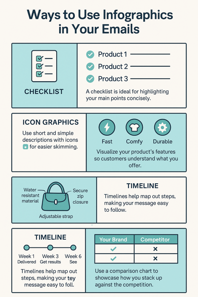
1. Checklists
- Why they work: Checklists are a visually appealing, easy-to-read way to highlight key points. They’re perfect for showcasing benefits, features, or steps in a process.
- Impact: Instead of a dull paragraph, a checklist instantly communicates your message while adding a structured, scannable design element.
- Best use case: Product benefits, step-by-step instructions, pre-purchase guides.
2. Icon Graphics
- Why they work: Icons are instantly recognisable symbols that allow readers to absorb meaning without reading.
- Impact: An email featuring icons for each benefit of a product lets the audience grasp your value proposition at a glance.
- Best use case: Highlighting features, product categories, service benefits.
3. Feature Diagrams
- Why they work: Feature diagrams combine images and descriptive text to visually explain specific product features.
- Impact: They help customers see exactly what they’re getting, making the buying decision easier.
- Best use case: New product launches, product deep-dives, onboarding materials.
4. Timelines
- Why they work: Timelines map out events in chronological order.
- Impact: They show the customer journey, when they can expect results, or tell your brand story in a logical flow.
- Best use case: Project updates, product history, brand evolution, customer onboarding.
5. Numbered Lists
- Why they work: Like checklists, numbered lists make information structured and digestible.
- Impact: They are great for “Top 5” or “3 Key Reasons” style emails, offering an engaging alternative to plain text.
- Best use case: Tips, product comparisons, benefit breakdowns.
6. Comparison Charts
- Why they work: These charts show clear side-by-side differences between products or brands.
- Impact: They make it easy for customers to see why your product is the better choice without reading lengthy copy.
- Best use case: Competitive product comparisons, feature breakdowns, package options.
7. Tables
- Why they work: Tables neatly organise information into categories, making it easy for the brain to follow.
- Impact: They can be paired with icons for even quicker comprehension.
- Best use case: Pricing tiers, service packages, event schedules.
8. Flow Charts
- Why they work: Flow charts use a path-based visual to show how things connect or guide readers to the right choice.
- Impact: Instead of just listing product options, you can walk customers through use cases in an engaging way.
- Best use case: Product recommendation guides, troubleshooting workflows.
9. Graphs
- Why they work: Graphs transform numbers into easy-to-read visuals that highlight trends or comparisons.
- Impact: Instead of listing out statistics, you can help customers visualise the value you’re offering.
- Best use case: Survey results, growth metrics, performance data.
Final Thoughts
In a world where attention spans are short, graphical content—especially infographics—can transform your email campaigns from forgettable to unforgettable. By mixing different formats like checklists, timelines, flow charts, and comparison charts, you keep your audience engaged while delivering valuable content in a way that’s easy to understand.
If you want your emails to be read, remembered, and acted upon, start making visual content a core part of your strategy.